

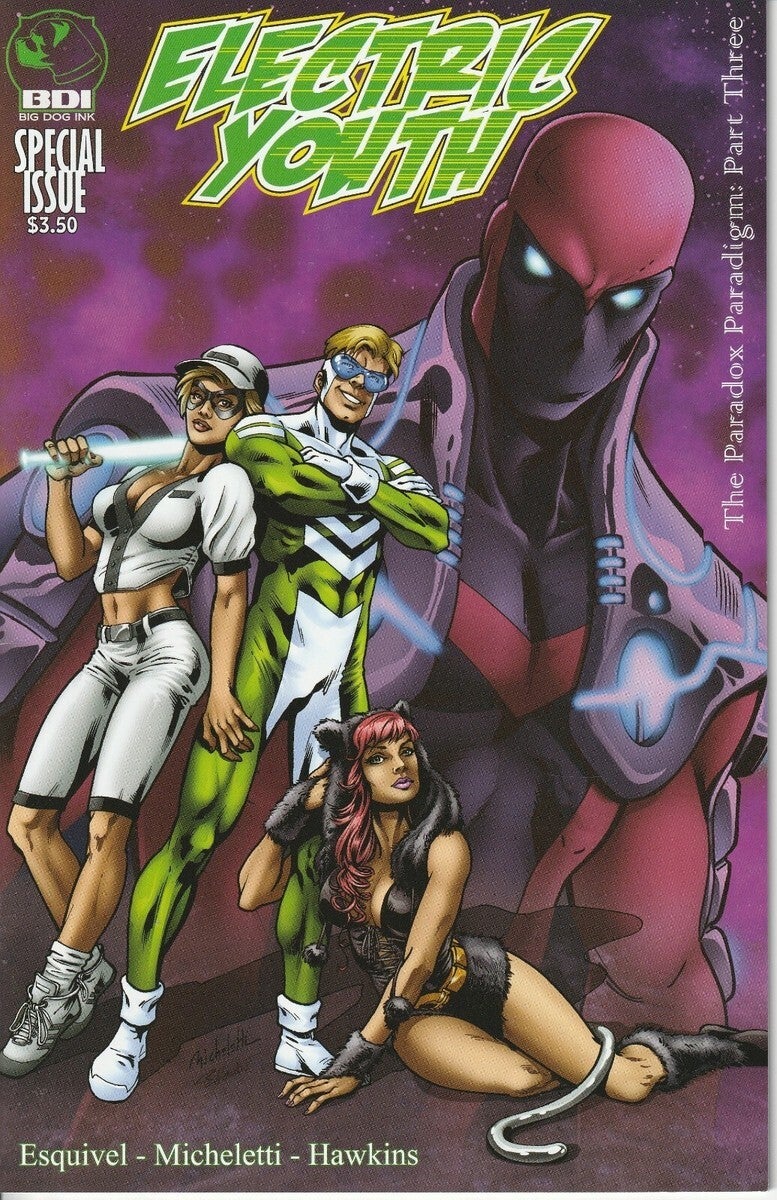
Critter Electric Youth cover A
---
Electric Youth — Review
Title & Iconography
The title treatment of Electric Youth is one of the book’s strongest opening moves. The outlined lettering, the color choices, and the speed‑dash accents across the name create the illusion that the hero himself tagged the wall and vanished in a blur. It’s clever visual storytelling — an emblem that functions like a graffiti‑era reinterpretation of classic speedster iconography.
It pulls from the lineage of The Flash while leaning into a Mark of Zorro‑style signature flourish. It’s iconic, immediate, and character‑defining.
---
Cover A
Cover A’s strongest element is the ominous background figure. The interplay of purple tones and dark red shading gives the entire composition a looming, foreboding presence — especially with the single eye in the sky watching over everything. There’s a genuine sense of dread baked into the palette.
The foreground, however, leans into a Star‑Wars‑style grab‑and‑pose dynamic that doesn’t quite land. The thigh‑clutch, shoulder‑lean tableau suggests a hero who is the center of attention in a way that feels more self‑mythologizing than heroic.
Depending on the reader, it can read as:
- Self‑aggrandizing fantasy
- A metaphor for how the character sees himself
- A stylistic exaggeration of street‑level grit
Structurally, though, the cover isn’t poorly built. The Crittersverse house style uses line grit as texture, not as a flaw. The characters look battle‑hardened, streetwise, and sly, which fits the tone.
---
Cover B
Cover B is the standout.
It makes the character relatable, energetic, and heroic without ego. The anatomy is clean, the runner’s posture is believable, and the composition sells the idea that he’s been sprinting through the comic itself before stopping to wave at the reader.
The Electric Youth logo reinforces this — it now feels like he literally wrote it mid‑run, circled the page, and arrived in front of us.
Structurally and thematically, this cover works.
---
Interior Paneling & Characterization
The paneling is solid, but the character himself is written with a very specific — and sometimes abrasive — energy. He reads like:
- The Flash’s morality dialed down
- Wally West’s impulsiveness dialed up
- A touch of The Boys in terms of entitlement
He’s the type of character who would undo your bra without asking and whisk you to Paris in a third of a second — and the book treats this as charming rather than questionable.
If he weren’t the protagonist, he’d be framed as a borderline villain.
This isn’t a flaw so much as a stylistic choice. The book wants him to be chaotic, cocky, and morally askew from the moment he arrives.
The lightning‑bolt boxers are a fun nod to Flash‑family iconography.
---
Art, Coloring & Lettering
The illustrator and letterer deserve real praise.
The anatomy is clean, the coloring is vibrant, and the lettering is exceptional — especially for readers who grew up on Jessica Jones or X‑Men where lettering carries emotional weight.
A standout example:
When the main character is punched into a portal, the red outline around the “what the—” gives the moment a sonic punch.
If this were a film, you’d compliment the sound design.
---
Story Structure
The introduction of the second speedster follows the classic Marvel/DC formula:
1. They fight for no reason
2. They become allies
3. They save the world
It works, but it lacks deeper character motivation. The new character exists because the plot needs him, not because the story earned him.
The overall narrative is serialized, moving in a circle so the next adventure can begin. It reads more like an introduction arc than a complete story — not my preferred style, but not inherently flawed.
---
Final Thoughts
If you enjoy:
- Energetic male leads
- A blend of Flash‑style speedster tropes
- A touch of The Boys irreverence
- Strong anatomy, bold coloring, and excellent lettering
Then this is a solid pick.
Score:
- 3.5–4.0 if you enjoy this type of protagonist
- 2.5 if the “entitled male lead” archetype turns you off
The book’s greatest strengths are its structural anatomy, coloring, lettering, and serialized momentum.
Overall: A pretty good book — and absolutely worth recommending.
---